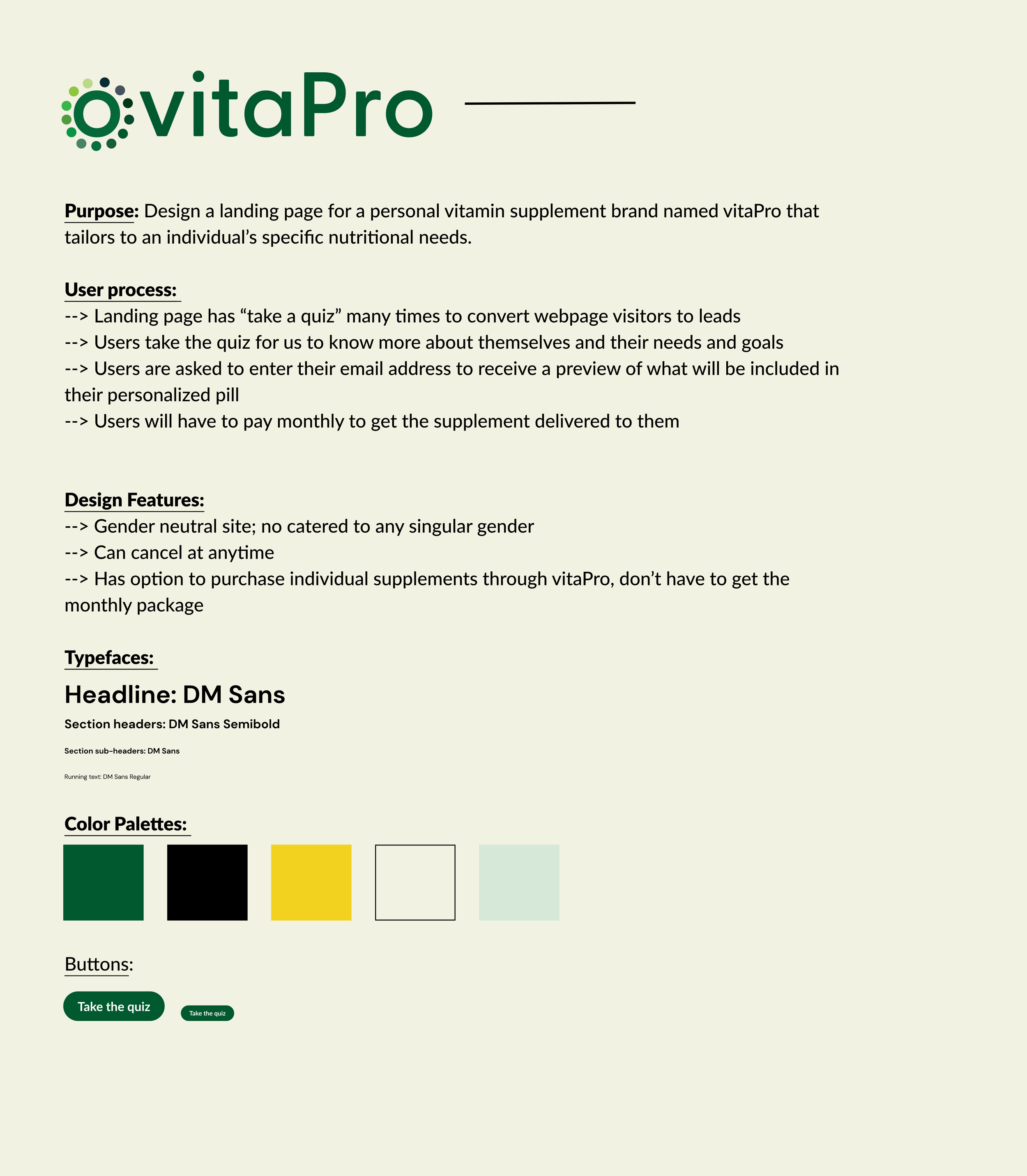
vitapro landing page
vitaPro is a personal vitamin supplement brand that tailor's to an individual's specific nutritional needs. The brand allows customers to take a quiz that determines what their specific nutritional and personal needs are for their overall holistic wellbeing to maintain their best nutritional levels. This landing page contains the type of information one would need to gather a user from a visitor to convert them to a lead.
Tools
Figma
Adobe Photoshop
Adobe Illustrator
My Role
User research and competitive analysis
Creating User persona
Empathy map
Customer journey map
Wireframes and prototypes
Mock-up and visual designs
Timeline
Overall: 2 weeks
Discovery & Research: 1 weeks
Design & testing: 1 weeks
Step 1: Empathize
Develop a deep understanding of the target audience/customer/consumer and their unique perspective to identify and address the problem at hand
User Interviews
As a foundational component of UX research and design, these interviews played crucial role in uncovering user insights, validating ideas, and ultimately creating products that meet user needs and deliver exceptional experiences.
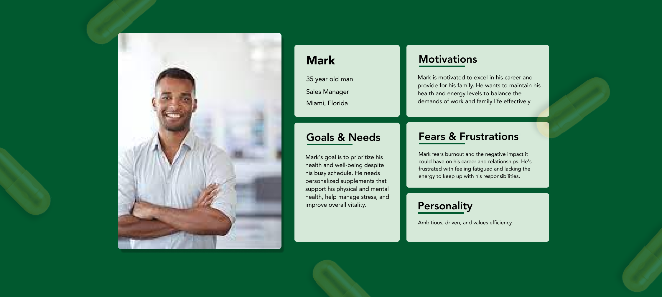
User Personas
I wanted to form a deeper understanding of my users' goals, needs, experiences, and behaviors. So, I created 4 personas for each of our user segments. They were based on user interviews and surveys, and I kept updating them throughout the project as we gathered more data. I used these personas whenever I wanted to step out of ourselves and reconsider the initial ideas. Here is an example of one of the personas.
Step 2: Define
Define the problem statement clearly - the ideal problem statement captures the perspective of human-centered needs rather than focused on business goals
Problem Statement
In the industry so far, a lot of vitamin supplements cater to only women, and have colors or visuals on their webpage that are more feminine.
How can we make a landing page for this vitamin supplement brand that caters to a wide range of users that can easily convert visitors to leads?
Step 3: Ideate
Brainstorm ways to address those unmet needs found in the problem statement, create drawings, and low-fidelity wireframes
The Solution
My goal as the user interface and brand designer was to make the brand and website more gender neutral. In this way, the vitamin supplement industry would be more inclusive, and increase the number of leads at the same time by making it appeal to a wider audience.
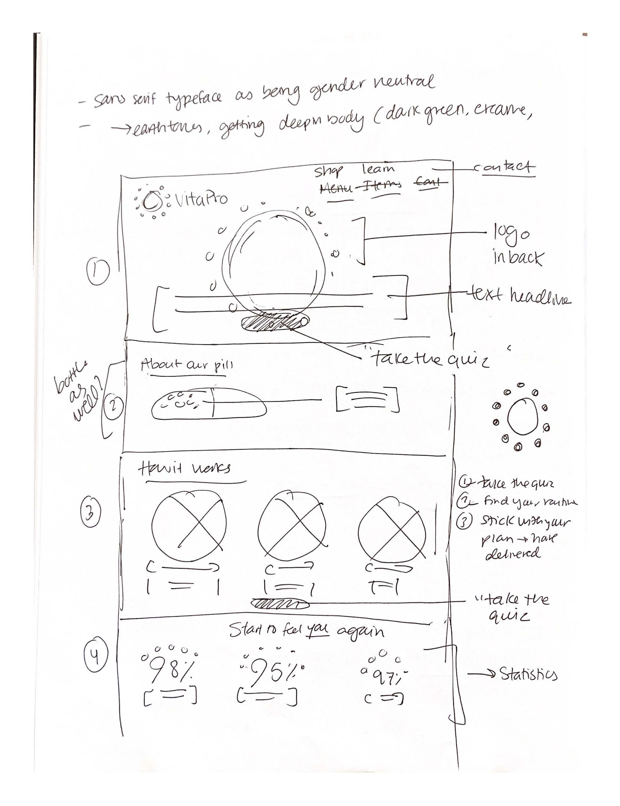
Some sketches…
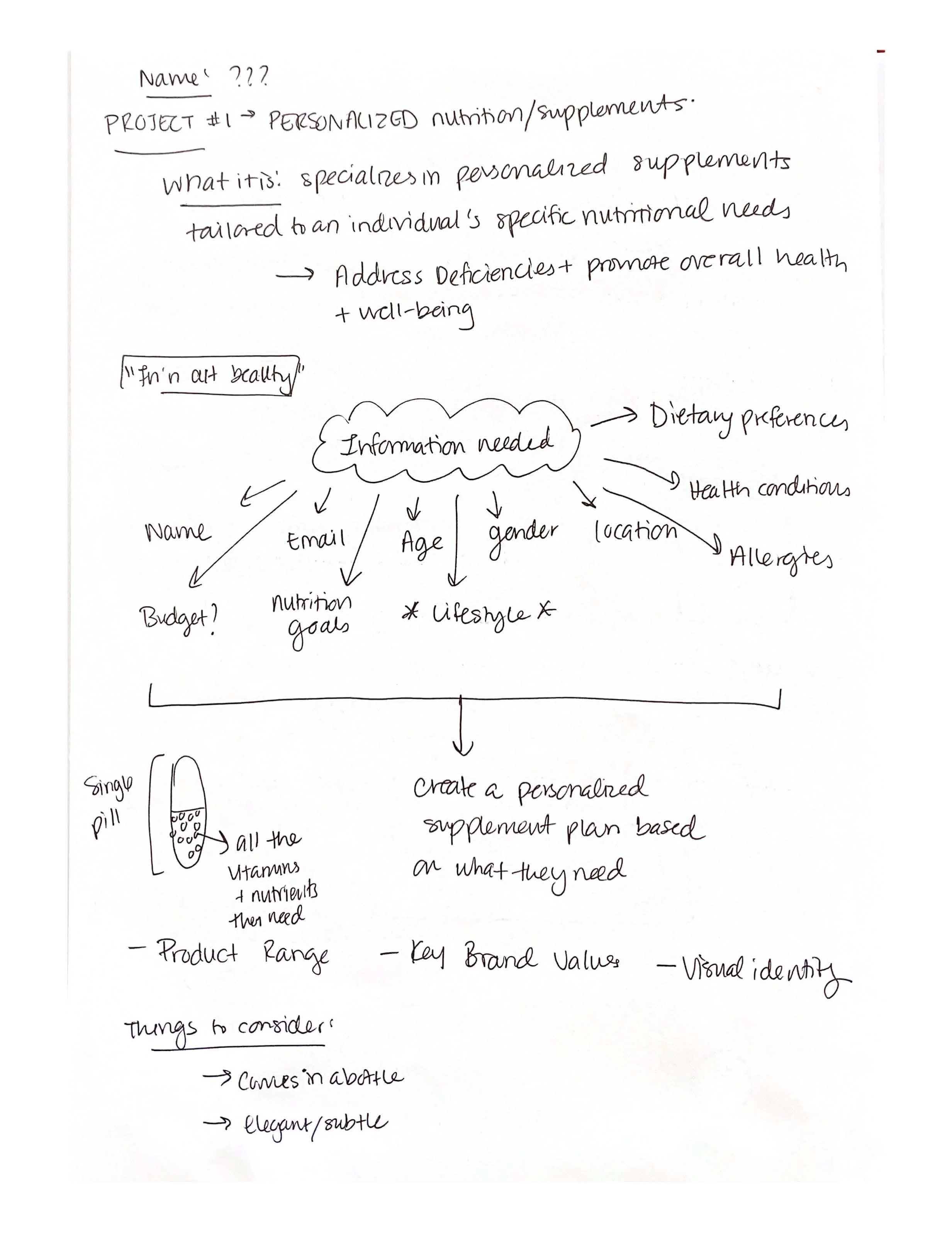
In the initial stages of developing the idea for vitaPro, I started thinking about the specific features that could potentially convert a visitor to a lead on the site as well as the information I would need from them.
Some selling points for the subscription service was that it was only a singular pill to be taken daily that met all their nutritional and personal needs, they could cancel anytime, and that the brand itself was very inclusive. Additional features allowed users to opt for the individual supplements instead if they did not want to pay for the monthly subscription service.
Wireframes
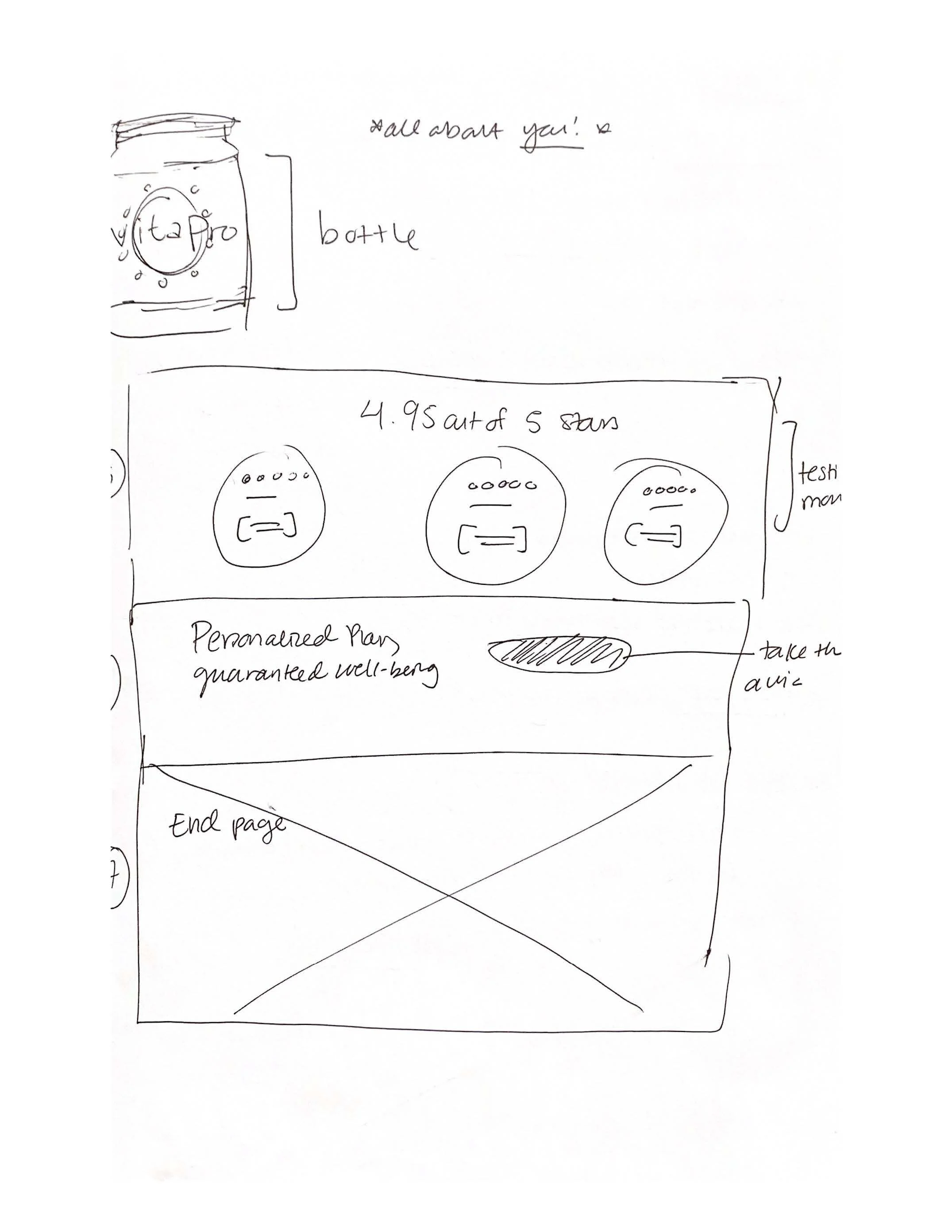
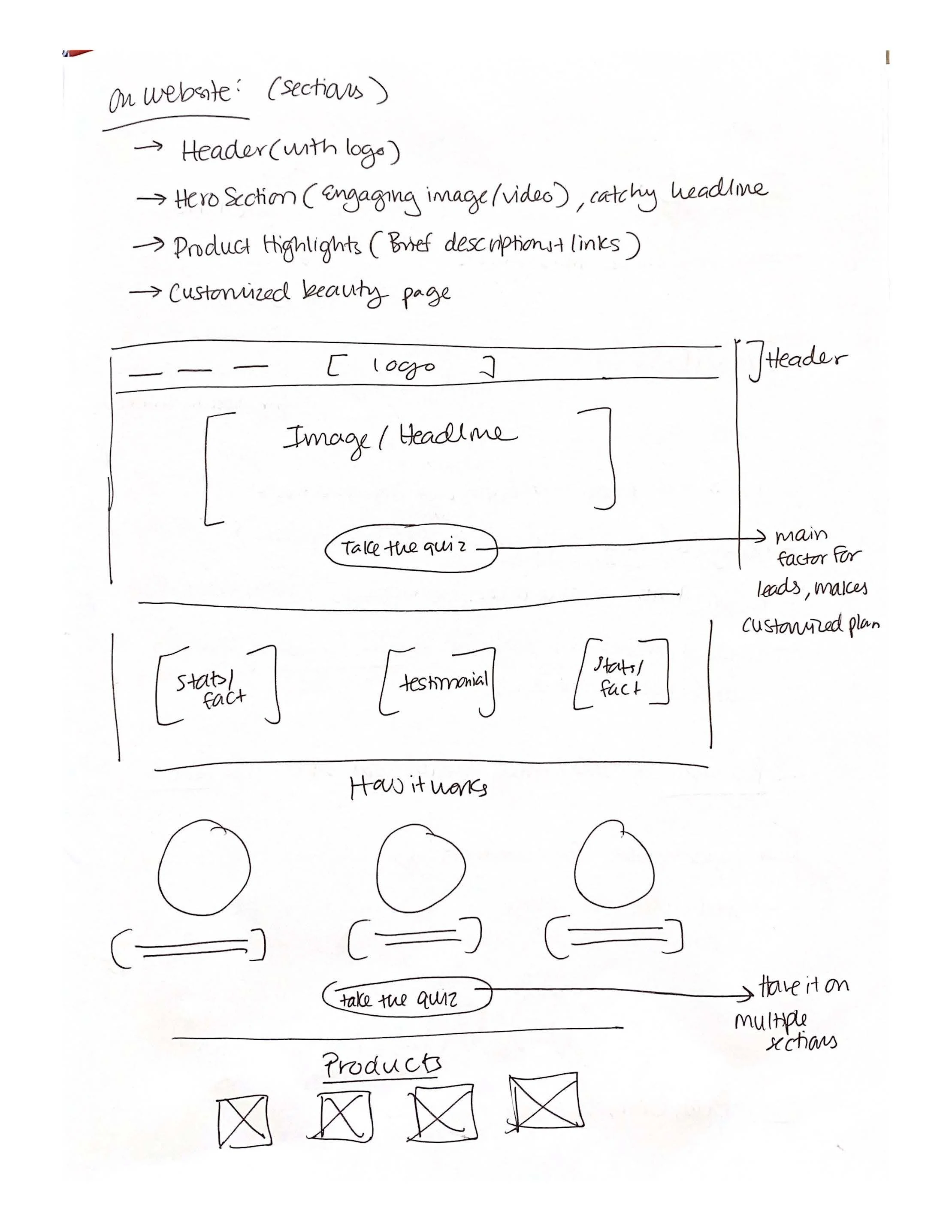
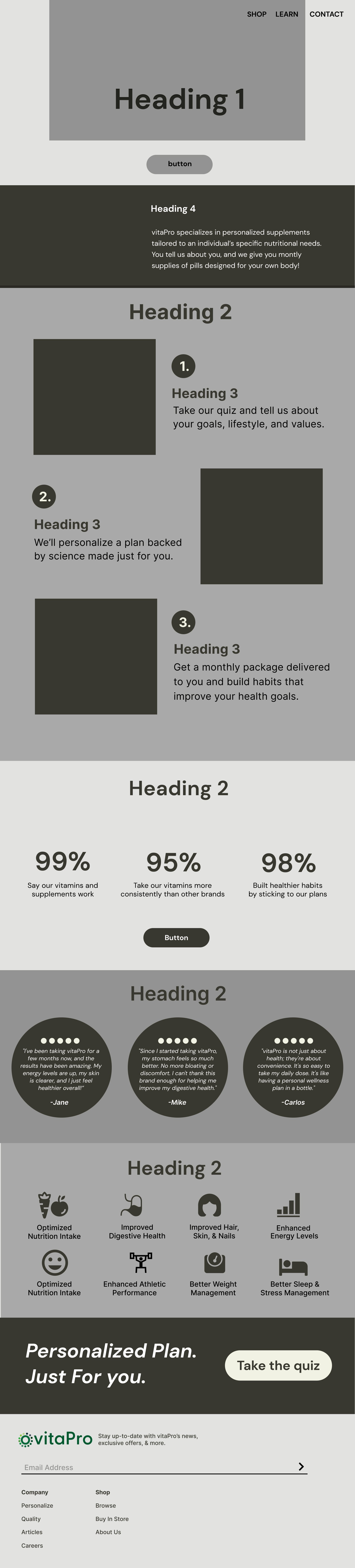
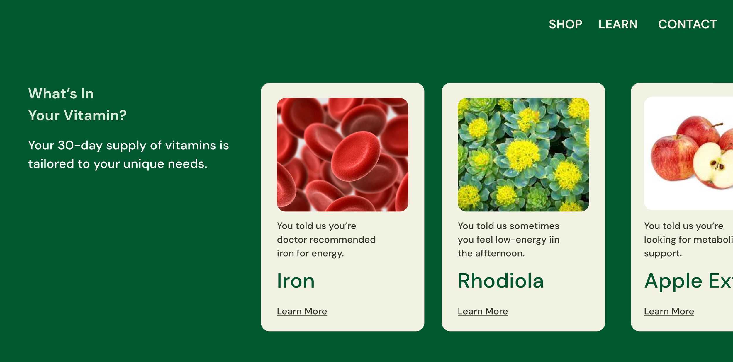
Using Figma, I translated my first sketches into low-fidelity wireframes. The main goal of the landing page was to highlight that this is a personalized nutritional/supplement brand that is tailored to an individual's specific nutritional needs. Through information such as a customer's name, age, gender, allergies, health conditions, and dietary restrictions.
On the website, it was also important to highlight the product range, key brand values, and visual identity. For the sections of the site, it was important to have:
a header with the logo
Hero section that has an engaging image/video with a catchy headline
a section with product highlights
a customized beauty page
The Final Prototype!
Step 4: Prototype
Turn my ideas from Stage 3 into Prototypes so that it can be tested on real users
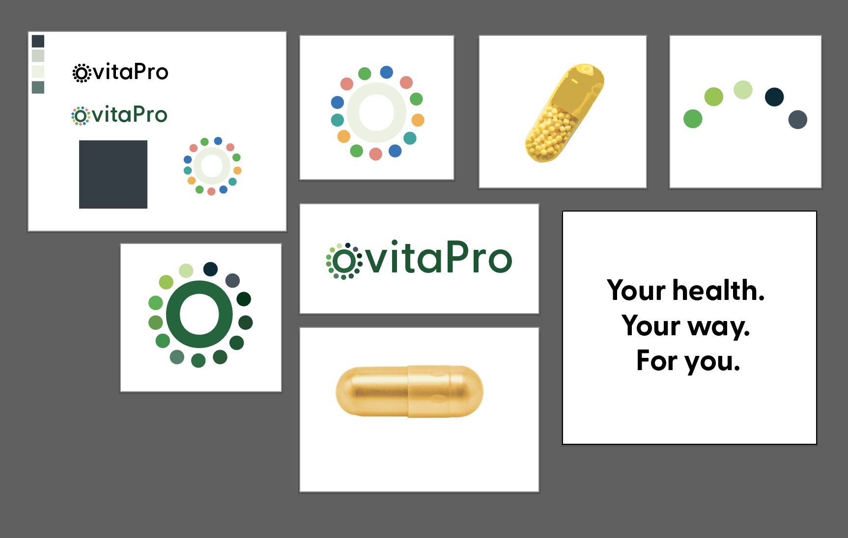
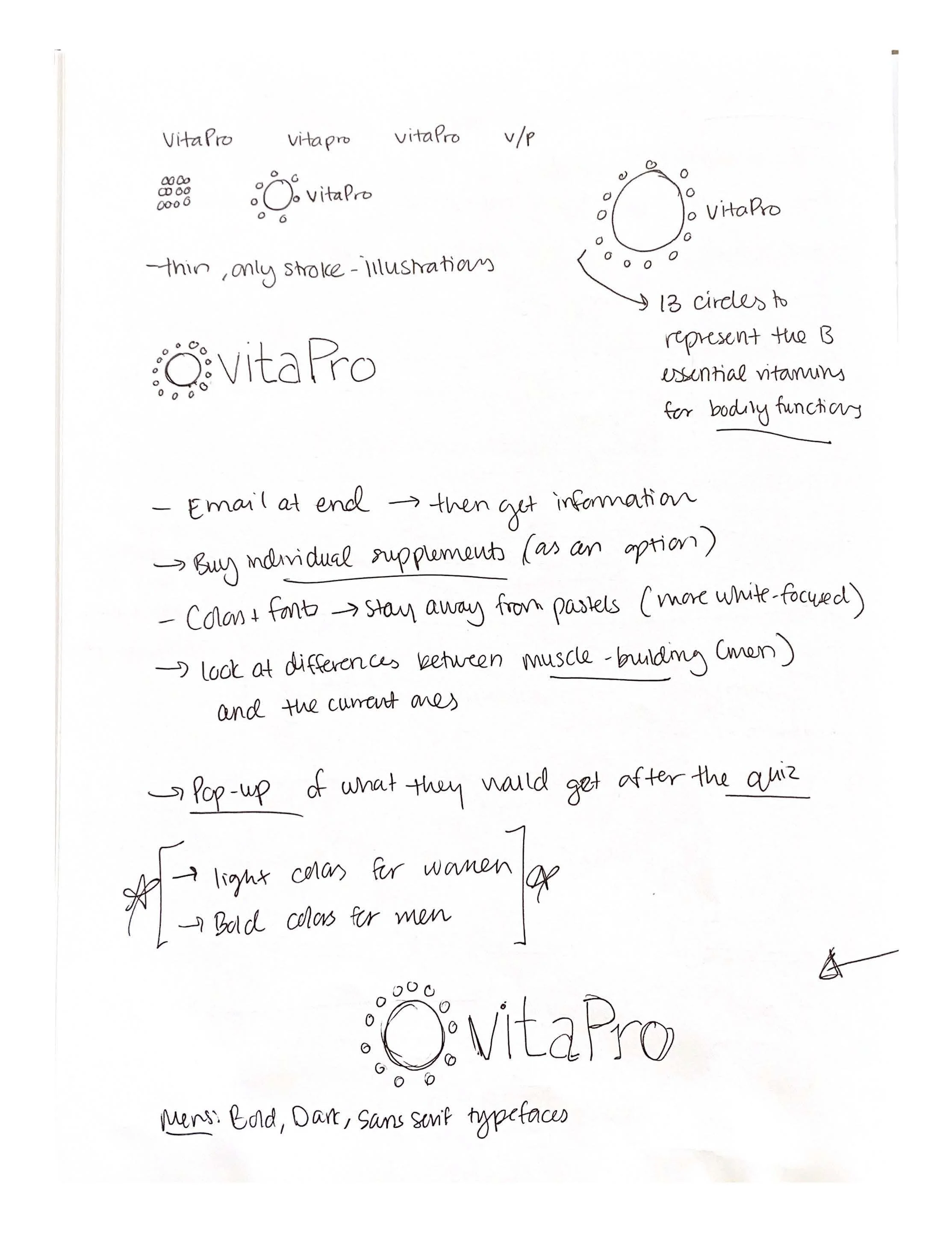
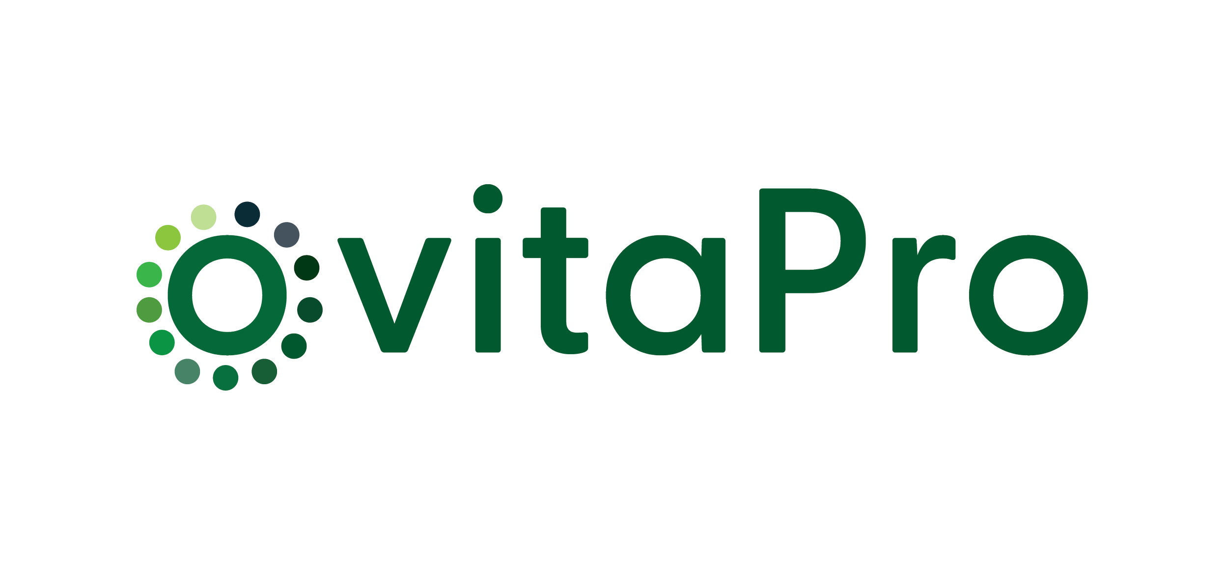
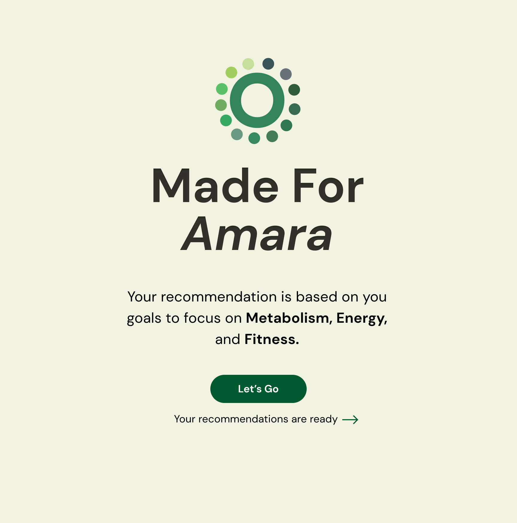
Once the usability issues were resolved, I moved on to design the final screens in Figma. My goal was to create a visual identity that’s aligned with the brand’s values and message, which is: “Your health, Your way. For you."
I decided on the serif typeface of inter to keep it gender neutral
For the colors, I decided on earth tones to represent it to be natural and bodily, such as greens and creams.
Each section of the landing page was well thought out to make it intentional for the user and have a "call to action" for them to transition from a visitor to a lead.
vitaPro personalized vitamin intro page


Learnings
While designing this landing page, I learned a lot about creating a brand identity from the ground up, as well as making an engaging landing page that would convert a visitor to a lead.
vitaPro personalized vitamins page
Developing the brand identity
While developing the brand identity of this brand, there were many factors I had to consider, such as: colors and fonts to make it more gender-inclusive, as well as the imagery I am using. The 13 circles for the logo represent the 13 essential vitamins for bodily functions.